One of the primary issues affecting our society right now is the unequal distribution of wealth. As the saying goes, the rich get richer and the poor get poorer. But in the past 30-35 years, this gap between the ultra wealthy and the rest of us has gotten increasingly wider.
This is a topic that doesn’t get discussed very often in the mainstream media, and there is a lack of knowledge and understanding about it. So let’s look at a few charts that will help us get a sense of just how much wealth inequality has grown in the US and why.

Figure 1: Showing the distribution of wealth among different income percentiles in 2024.
The first chart shows the percent of ownership of wealth in the US by different economic brackets. The top 0.1% own 13.5% of total wealth in the US. Those people in the 99 to 99.9 % bracket own 16.7% of total wealth. Then those in the top 90 to 99% bracket own 35.5% of the total wealth.
This means that the top 10 percent of wealthy people in this country own 65.7 percent of all the wealth. Meanwhile, 66,551,860 million Americans in the bottom 50% hold only 2.5% of wealth.
It hasn’t always been this way, though. During the Postwar Era into the 1970s, there was a sort of shared prosperity in the United States, but this began to unravel during the trickle-down era of Presidents Reagan and George H.W. Bush.
In Figure 2, shown below, we can see the growth in the share of national wealth owned by the different economic brackets. From 1989 onward, the share of wealth owned by the bottom 50% of Americans has not really grown, remaining relatively flat. But for the top 50% and above, especially the ultra-rich, their share of wealth in this country has exploded.

Figure 2: Showing the change in wealth ownership per percentile from 1989 to 2020.
Looking further back, we can see some factors that helped this wealth inequality to take off in the late 1980s and early 1990s.
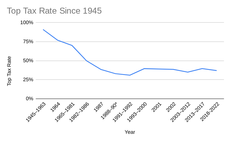
Figure 3: Showing the tax rate for the top income bracket in the US tax code, from 1945 to 2022.
According to Figure 3, the tax rate for the top income bracket in the United States started dropping from the wartime high of over 90% in the postwar period through the 1970s. Beginning in 1982 and lasting through the early 1990s, however, taxes on the top income bracket were cut significantly. In 2022, the average tax rate for top earners was actually around 23 percent. This is quite a change from the post war period.
This reduction of the top tax rate was done according to the trickle-down theory of economics where if the rich could keep their money, they would invest it in ways that helped the overall economy and regular people. But this is not how rich people operate, and it is not what has happened at all. They have invested it in luxury goods, property, and in controlling the political process.
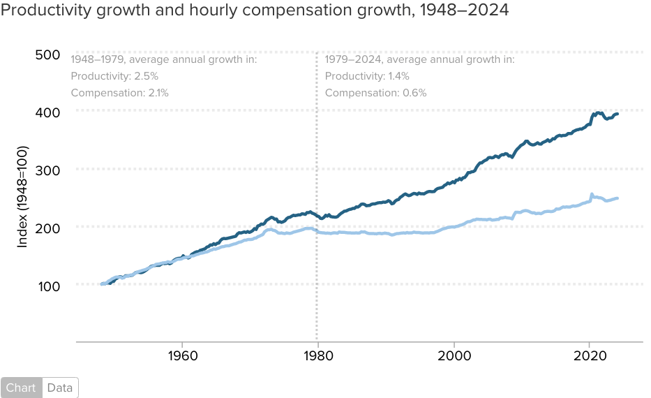
Figure 4: Showing Productivity Growth versus hourly compensation growth from 1948 to 2024.
In this figure, the relationship between productivity and wages is examined. Between 1948 and 1979, the growth in productivity and wage increases were relatively the same. But between 1980 and the present, they have become unbalanced, with the average yearly wage increase being only 0.6% per year after 1980, compared to 2.1% per year before.
In short, those who own the workplace have gotten more production from American workers and have had to pay less wages for it. That difference in money has to go somewhere, and it has gone to the top.

Figure 5: Showing the growth in real wages, as adjusted for inflation, from 1979 to 2013.
This next chart shows the growth in wages with inflation factored in. The bottom 10 percent of wage earners in the US have actually seen a decrease in their wages versus the rise in inflation. Even middle wage earners, those in the 50th percentile have only seen modest growth in the actual purchasing power of their wages.
All of these factors have combined to create the enormous wealth inequality that we see in society today. Cutting the tax rate for the most wealthy resulted in more of the money in society going to the top. The growth in productivity and increase in inflation also helps to shift wealth to the top. This is especially true in relation to wage increases being mostly stagnant over the last 30 years or so.
All this money has gone to the top of our society, it has allowed the wealthy to invest that extra money in ways that make regular people’s lives harder. I will be exploring why this inequality is unhealthy and unstable for society in future blogs.
Sources for Figures
Figure 1: U.S. wealth distribution Q2 2024. Published by Statista Research Department, Oct 29, 2024. https://www.statista.com/statistics/203961/wealth-distribution-for-the-us/
Figure 2: Federal Reserve data. https://www.reddit.com/r/economy/comments/1cj69xf/top_10_of_americans_own_70_of_the_nations_wealth/#lightbox
Figure 3: Historical Income Tax Rates. https://www.wolterskluwer.com/en/expert-insights/whole-ball-of-tax-historical-income-tax-rates
Figure 4: Wage Stagnation in Nine Charts https://www.epi.org/publication/charting-wage-stagnation/
Figure 5: Wage Stagnation in Nine Charts https://www.epi.org/publication/charting-wage-stagnation/
